

Customisation
We believe in seamless integration experience but we also know that every client has their own way of developing apps by managing UI state with their own business logic and would have their own UX design. Therefore we want to provide different level of customisation which you could choose from based on your level of time and efforts needed to drive your business needs.
Theme Customisation
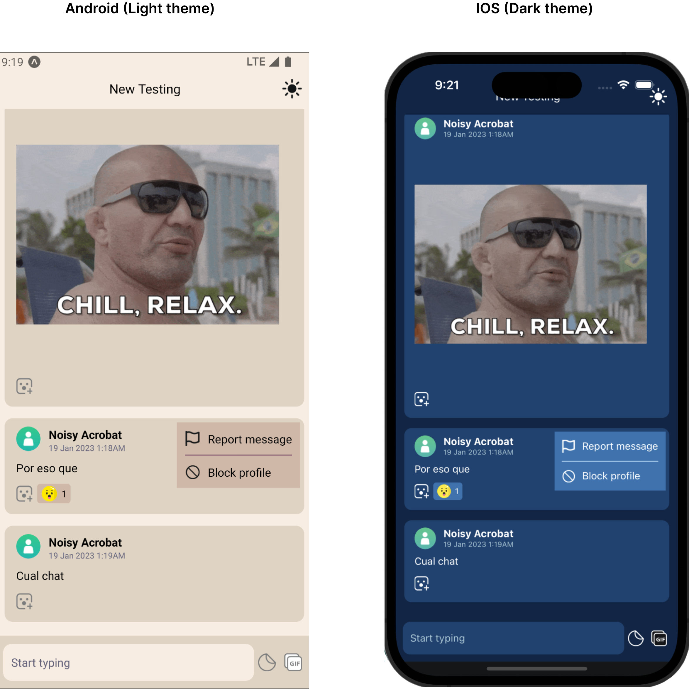
You could customise dark and light theme colors to match your App design system. Use setThemes function provided by useTheme hook to set your custom theme.
Example:
Setting custom dark and light theme
import React, { useCallback, useMemo, useLayoutEffect } from 'react';
import {
  StyleSheet,
  Text,
  View,
  Platform,
  ActivityIndicator,
  Image,
  TouchableOpacity,
} from 'react-native';
import {
  useInit,
  LLChat,
  useTheme,
  LLThemeType,
  LLChatHeaderProps,
  useStyles,
  LLThemes,
} from '@livelike/react-native';
import ThemeLight from './assets/theme-light.png';
import ThemeDark from './assets/theme-dark.png';

const myCustomTheme: LLThemes = {
  [LLThemeType.DARK]: {
    text: '#ffff',
    secondaryText: '#A3C7D6',
    background: '#0A2647',
    secondaryBackground: '#144272',
    thirdBackground: '#144272',
    popoverBackground: '#2C74B3',
    inputBackground: '#144272',
    primaryButtonBackground: '#2C74B3',
    border: '#BBE1FA',
    info: '#4ECCA3',
    error: '#EB455F',
  },
  [LLThemeType.LIGHT]: {
    text: '#000',
    secondaryText: '#65647C',
    background: '#F8EDE3',
    secondaryBackground: '#DFD3C3',
    thirdBackground: '#DFD3C3',
    popoverBackground: '#D0B8A8',
    inputBackground: '#F8EDE3',
    primaryButtonBackground: '#85586F',
    border: '#85586F',
    info: '#4ECCA3',
    error: '#EB455F',
  },
};

export default function App() {
  const { profile, loaded } = useInit({
    clientId: '<Your App client Id>',
  });
  const { setThemes } = useTheme();

  const appStyles = useStyles({
    componentStylesFn: stylesFn,
  });

  useLayoutEffect(() => {
    setThemes(myCustomTheme);
  }, []);

  if (!loaded) {
    return (
      <ActivityIndicator style={{ display: 'flex', flex: 1 }} size={'large'} />
    );
  }

  if (!profile) {
    return <Text style={appStyles.errorContainer}>Error loading profile</Text>;
  }

  return (
      <LLChat
        roomId="<Your Chat room Id>"
      />
  );
}
UI Customisation
Using React Native SDK, based on your business requirement and based on your level of customisation efforts there could be 4 ways to achieve it:
- Stock UI.
- Stock UI + custom Presentational Component.
- Hooks + custom Component.
- JS API + custom UI.

Customisation Time vs Effort
Let us try to understand these customisation in detail.
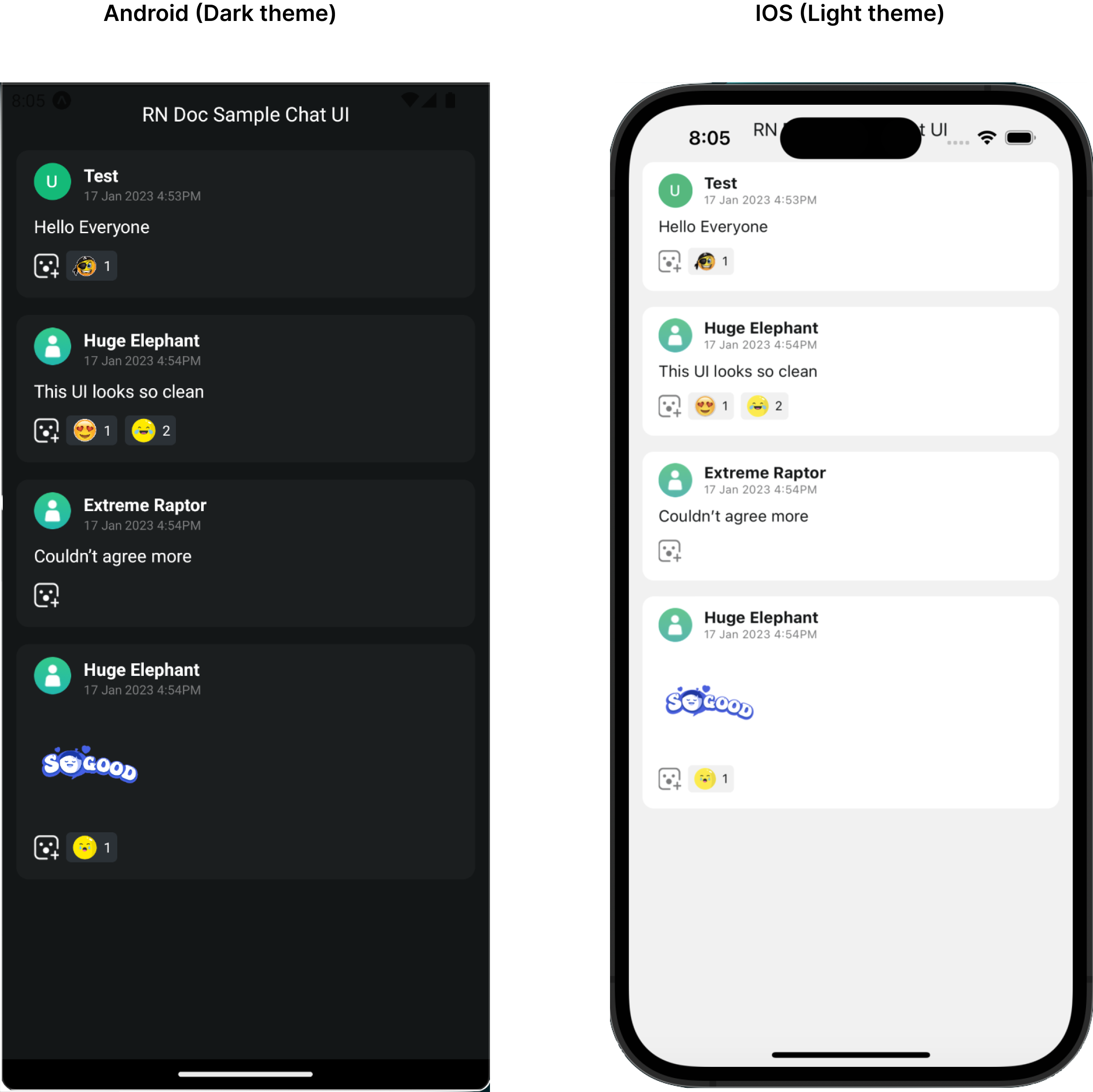
1. Stock UI:
This is the simplest and easiest way to integrate LiveLike Stock UI components requiring less efforts and time. Our stock UI offers:
- Highly customisable and themeable UI for most of our LiveLike services.
- Abstract out the UI implementation and state management complexity.
- Out of box seamless integration experience.
You could start integrating React native components using this option and gradually move towards 2nd option.
Example:
Lets say you want to integrate LiveLike chat community service, you could import LLChat and pass roomId required prop.
Need to initialise the SDKBefore rendering or using any functionalities from React Native SDK, make sure to initialise the SDK
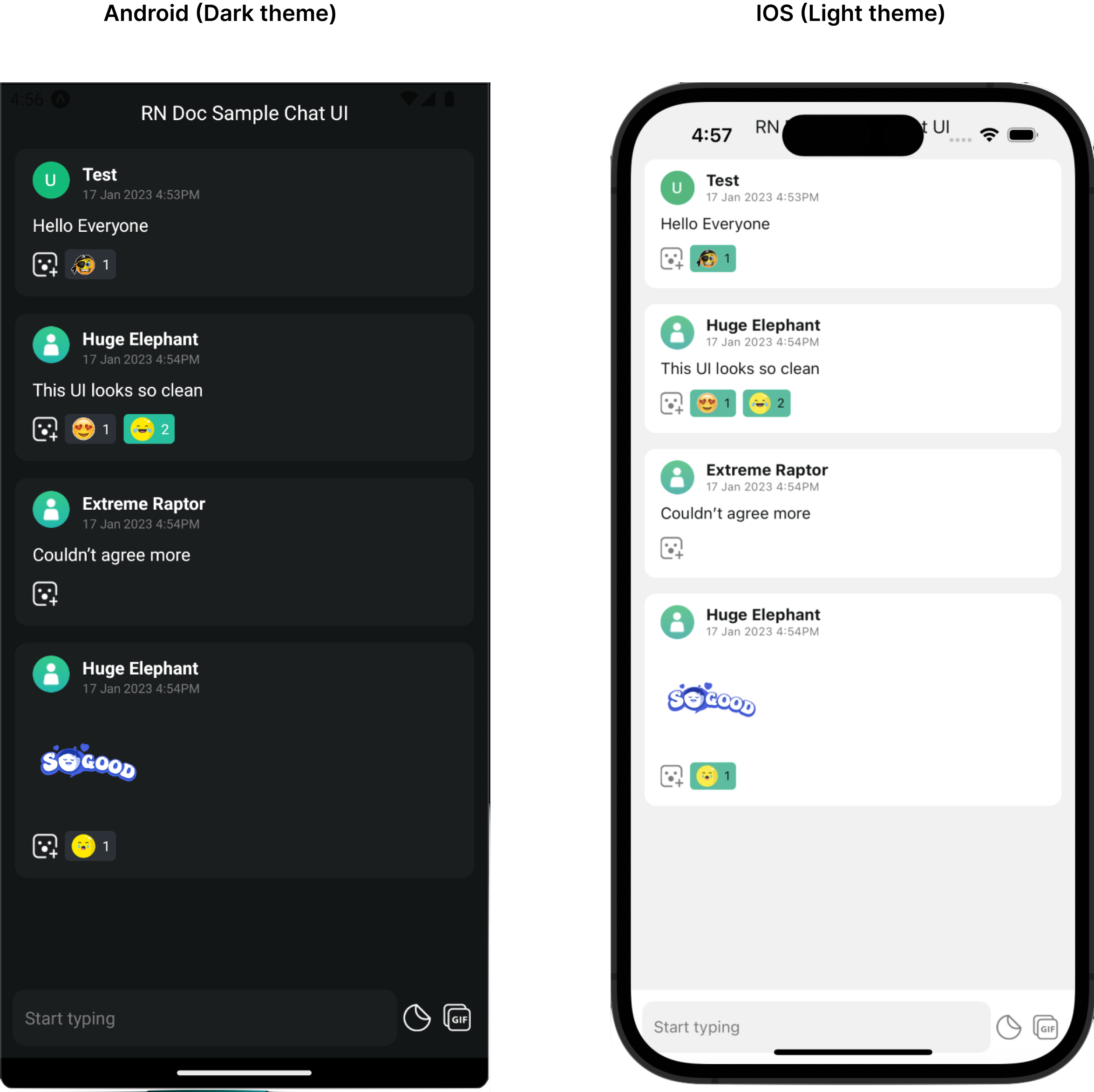
import React from 'react';
import { ActivityIndicator } from 'react-native';
import { useInit, LLChat } from '@livelike/react-native';

export default function App() {
  const { loaded } = useInit({
    clientId: '<Your App client Id>',
  });

  if (!loaded) {
    return <ActivityIndicator />;
  }

  return <LLChat roomId="<Your Chat room Id>" />;
}
This render a complete Chat UI with a chat header, message list and a chat message composer, user reaction and moderation capabilities.
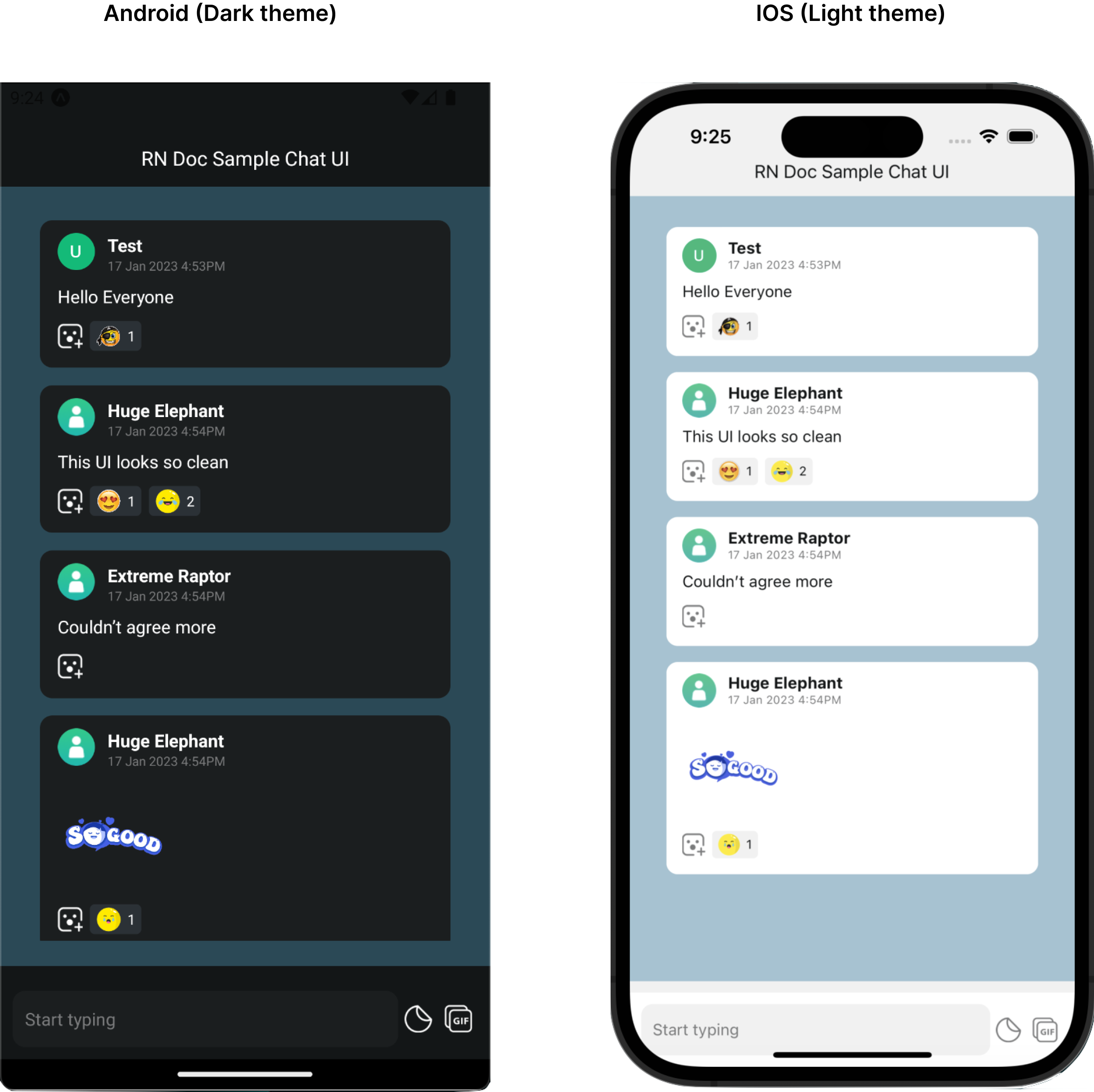
2. Stock UI + Custom Presentational Component:
This way of customisation would require less time but more efforts than 1st option. This could be your preferred way if the Stock UI implementation suffice your business needs but you just want to customise the smaller fraction of presentational part of the UI based on your application UX design. Our container components accepts two props with which you could customise the presentational part.
a. XXXXYYYYComponent prop:
XXXXYYYYComponent prop:This lets you to pass your own custom component needed to be rendered by a given a component with the help of which you could completely customise the UI. For more details on what props would be passed to your rendered custom component, refer the corresponding component documentation.
b. XXXXYYYYStyle prop:
XXXXYYYYStyle prop:This lets you tweak or change styles of child component for a given component for eg: adjust padding, change color, font size etc. Use Stylesheet.create API from react-native package to create styles object and to identify the needed style object properties, refer the corresponding component documentation. Usually all our component exports a XXXXYYYYStyles TS type which could be used to type this styles prop.
This prop design pattern is similar to React Native components for eg: FlatList
Example 1:
Taking above same example of rendering a chat UI, suppose your business requirement is to conditionally render composer component for an influencer chat where for non influencer there should not be any composer rendered.
import React, { useMemo } from 'react';
import { ActivityIndicator } from 'react-native';
import {
  useInit,
  LLChat,
  LLChatMessageComposerProps,
  LLChatMessageComposer,
} from '@livelike/react-native';

export function MyComposer(props: LLChatMessageComposerProps) {
  // assuming a hook which parses userProfil.custom_data value
  // and returns isInfluencer which was set using updateUserProfile JS API
  const isInfluencer = useIsInfluencer();
  if (isInfluencer) {
    return <LLChatMessageComposer {...props} />;
  }
  return null;
}

export default function App() {
  const { loaded } = useInit({
    clientId: '<Your App client Id>',
  });

  if (!loaded) {
    return <ActivityIndicator />;
  }

  return (
    <LLChat
      roomId="<Your Chat room Id>"
      MessageComposerComponent={MyComposer}
    />
  );
}
As seen in the code snippet example, passing ChatMessageComposerComponent prop as MyComposer component, renders no composer for normal userprofile and it would render LLChatMessageComposer for influencer profile.
Example 2:
Lets assume you want to change padding and background of list component and add top padding to chat header. This could be achieved by passing a custom header and message list styles prop.
import React from 'react';
import { StyleSheet, ActivityIndicator } from 'react-native';
import {
useInit,
LLChat,
LLChatMessageListProps,
LLChatMessageList,
LLChatMessageListStyles,
LLChatHeader,
LLChatHeaderProps,
LLChatHeaderStyles,
useTheme,
} from '@livelike/react-native';
export default function App() {
const { loaded } = useInit({
clientId: '<Your App client Id>',
});
const { themeType } = useTheme();
const messageListStyles = useMemo(() => messageListStylesFn(themeType), [themeType]);
if (!loaded) {
return <ActivityIndicator />;
}
return (
<LLChat
roomId="<Your Chat room Id"
HeaderComponentStyle={hearderStyles}
MessageListComponentStyle={messageListStyles}
/>
);
}
const messageListStylesFn: (
theme: 'light' | 'dark'
) => Partial<LLChatMessageListStyles> = (theme) =>
StyleSheet.create({
rootContainer: {
padding: 20,
backgroundColor: theme === 'light' ? '#A0C3D2' : '#2b4956',
},
});
const hearderStyles: Partial<LLChatHeaderStyles> = StyleSheet.create({
headerTitle: {
paddingTop: 50,
},
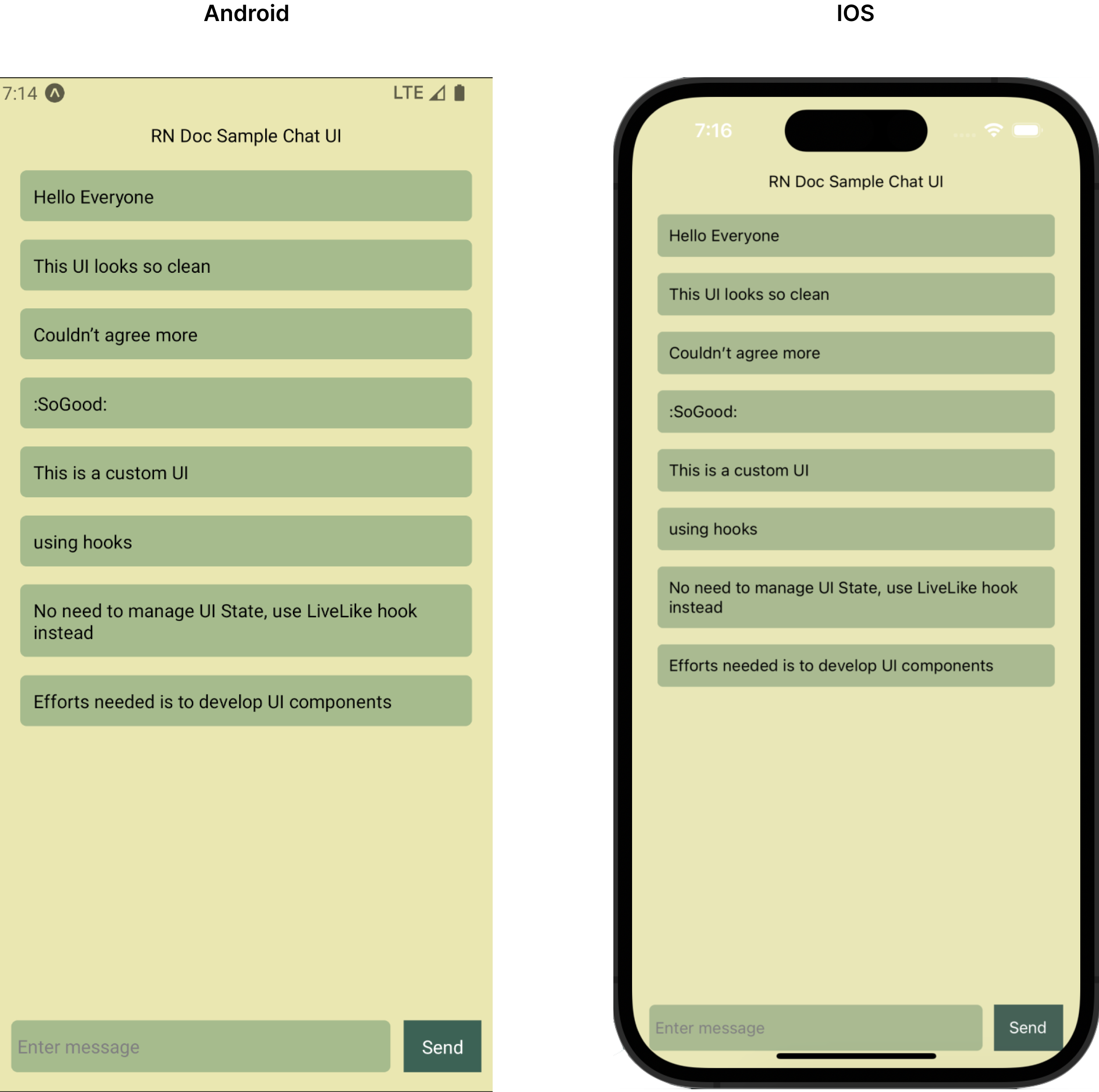
});3. Hooks + custom Component
This way of customisation lets you drive your own UI implementation completely in case your UX design is different than default stock UI.
Usually the need of this customisation would be when the UI state logic suffices your business needs but the component layout, component hierarchy and the rendered UI components is different than default stock UI where by using 2nd option (i.e using XXXXYYYComponent and XXXYYYYStyle props) you end up passing custom presentational component at each and every level. In this case driving your own custom UI would simplify your implementation and make it more manageable & scalable.
You could use our exported hooks that manages UI state for our Stock UI.
Example:
Taking same earlier example of rendering Chat UI, you could use useChatRoom and useChatMessages to render chat room details, message list and message composer.
import React, { useState } from 'react';
import {
  ActivityIndicator,
  View,
  Text,
  FlatList,
  TextInput,
  Button,
  StyleSheet,
  Platform,
  TouchableOpacity,
} from 'react-native';
import { useInit, useChatRoom, useChatMessages } from '@livelike/react-native';

export default function CustomApp() {
  const { loaded } = useInit({
    clientId: '<Your App client Id>',
  });

  if (!loaded) {
    return <ActivityIndicator />;
  }

  return <MyChat roomId="<Your Chat room Id" />;
}

const listItemKeyExtractor = (message) => message.id;

function MyChatMessageItem({ message: messageDetails }) {
  return (
    <View style={appStyles.messageListItem}>
      <Text>{messageDetails.message}</Text>
    </View>
  );
}

function MyChat({ roomId }: { roomId: string }) {
  // using useChatRoom hook to get chat room data
  const { chatRoom } = useChatRoom({ roomId });
  // using useChatMessages hook to get live message list and sendMessage function
  const { sendMessage, messages } = useChatMessages({ roomId });
  const [inputValue, setInputValue] = useState('');

  if (!chatRoom) {
    return <ActivityIndicator size={'large'} />;
  }

  return (
    <View style={appStyles.chatContainer}>
      <Text style={appStyles.chatHeader}>{chatRoom.title}</Text>
      <FlatList
        style={appStyles.messageList}
        data={messages}
        renderItem={({ item }) => <MyChatMessageItem message={item} />}
        keyExtractor={listItemKeyExtractor}
      />
      <View style={appStyles.composer}>
        <TextInput
          onChangeText={setInputValue}
          value={inputValue}
          style={appStyles.chatInput}
          placeholder="Enter message"
          placeholderTextColor={'gray'}
        />
        <TouchableOpacity
          style={appStyles.sendButton}
          onPress={() =>
            sendMessage({ message: inputValue, roomId }).finally(() => {
              setInputValue('');
            })
          }
        >
          <Text style={appStyles.sendButtonText}>Send</Text>
        </TouchableOpacity>
      </View>
    </View>
  );
}

const appStyles = StyleSheet.create({
  chatContainer: {
    display: 'flex',
    flexDirection: 'column',
    flex: 1,
    padding: 15,
    backgroundColor: '#EAE7B1',
  },
  chatHeader: {
    marginTop: Platform.OS === 'ios' ? 50 : 20,
    height: 30,
    display: 'flex',
    alignItems: 'center',
    justifyContent: 'center',
    width: '100%',
    textAlign: 'center',
  },
  messageList: {
    flex: 2,
    minHeight: 300,
    width: '100%',
  },
  messageListItem: {
    display: 'flex',
    padding: 10,
    margin: 7,
    borderRadius: 5,
    backgroundColor: '#A6BB8D',
  },
  composer: {
    display: 'flex',
    flexDirection: 'row',
  },
  chatInput: {
    flex: 1,
    height: 40,
    padding: 5,
    borderRadius: 5,
    backgroundColor: '#A6BB8D',
    marginRight: 10,
  },
  sendButton: {
    backgroundColor: '#3C6255',
    display: 'flex',
    justifyContent: 'center',
    width: 60,
    alignItems: 'center',
  },
  sendButtonText: {
    color: '#FFFF',
  },
});
4. JS API + Custom UI
This way of customisation lets you drive your own business logic to manage UI state in your own preferred way and render your own custom UI. This could be useful for an application owners who wants to gradually adopt LiveLike services in their existing app ecosystem where they already have their own UI state management and their own UX design. If needed you could still use our presentational components passing needed props to render the component.
JS API are part of Javascript package, so any JS API to be used are to be imported from @livelike/javascript package.
@livelike/javascript package.Example:
Taking same earlier example of rendering Chat UI, suppose you already have Redux as your React state management. You could use getChatroom and getMessageList JS API to load chat room details and message list in your state.
import { useEffect } from 'react';
import { getChatRoom, getMessageList } from '@livelike/javascript';
import { useDispatch, useSelector } from 'react-redux';

const initialState = {
  chatRoomDetails: undefined,
  chatMessages: [],
};

// assuming redux thunk is configured as middleware, this is a thunk function
// for loading side effects
export async function fetchChatRoomResources({ roomId }) {
  return async function fetchChatRoomThunk(dispatch, getState) {
    const responses = Promise.all([
      getChatRoom({ roomId }),
      getMessageList(roomId),
    ]);
    dispatch({
      type: 'chat/chatroomResources',
      payload: {
        chatRoomDetails: responses[0],
        chatMessages: responses[1],
      },
    });
  };
}

export async function fetchMessages({ roomId }) {
  return async function fetchMessagesThunk(dispatch, getState) {
    const { messages } = await getMessageList(roomId);
    dispatch({ type: 'chat/chatRoom', payload: messages });
  };
}

export function MyChat({ roomId }) {
  const dispatch = useDispatch();
  const chatRoom = useSelector((state) => state.chatRoomDetails);
  const messages = useSelector((state) => state.chatMessages);
  useEffect(() => {
    dispatch(fetchChatRoomResources({ roomId }));
  }, []);

  return (
    <>
      {
        // Your own custom Chat UI
      }
    </>
  );
}