Layout Best Practices
Chat and Widgets are meant to augment the video watching experience. This page explores Best Practices to make sure it doesn't get in the way of the content. This is mostly a challenge on Mobile and we will suggest best practices.
Usage observations
Most people prefer to watch 16:9 videos in landscape. Only when they jump into the chat will many switch momentarily to portrait to use a more natural keyboard layout. Focusing on the landscape layout is therefore important.
Chat
Great fit with new aspect ratios
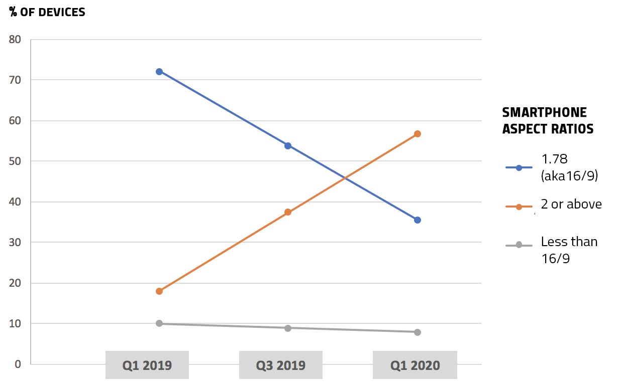
Mobile screen sizes have changed radically in 2019. In 2020, most phones won't be 16:9 in aspect ratio (although this varies per territory).

Aspect ratio of Smartphones
US Data from Statcounter.com
On mobile, people want to maximize screen estate: pillarboxing is not the best way to maximize screen estate and cropping video is often undesirable. With most recent smartphones featuring aspect ratios between 2 and 2,15, this gives you enough room to add chat while actually maximizing screen estate.
Especially keeping in mind older devices that are 16:9, avoid too large a chat as it will increase significantly the letterboxing.
Give user choices
To appeal to a broad audience you'll need to offer choices. Users under 35 respond very positively to chat & widgets, while users above 35 are more likely to want a way to hide chat or widgets.
Consider how you can integrate controls to show and hide chat in a natural and clear way into your video controls. The example below is just food for thought about how you could offer different viewing options:
Get creative and consider the following matrix of viewing options:
Viewing mode | Video cropped: OFF | Video cropped: ON |
|---|---|---|
| Chat tray with letterboxing | Chat tray with no letterboxing |
| Overlay + Tray Consider if a navigation sidebar can facilitate navigation of ancillary content (chat, stats...) | Overlay + No tray |
| No chat + Tray | No chat + No Tray |
Widgets
Much like chat, widgets should complement the video content and not take away from it.
Consider ways to overlay widgets in the least intrusive ways possible. If overlaying it on the video consider using a lower third placement. Consider also pop-in widgets on top of chat.
Updated 7 months ago
