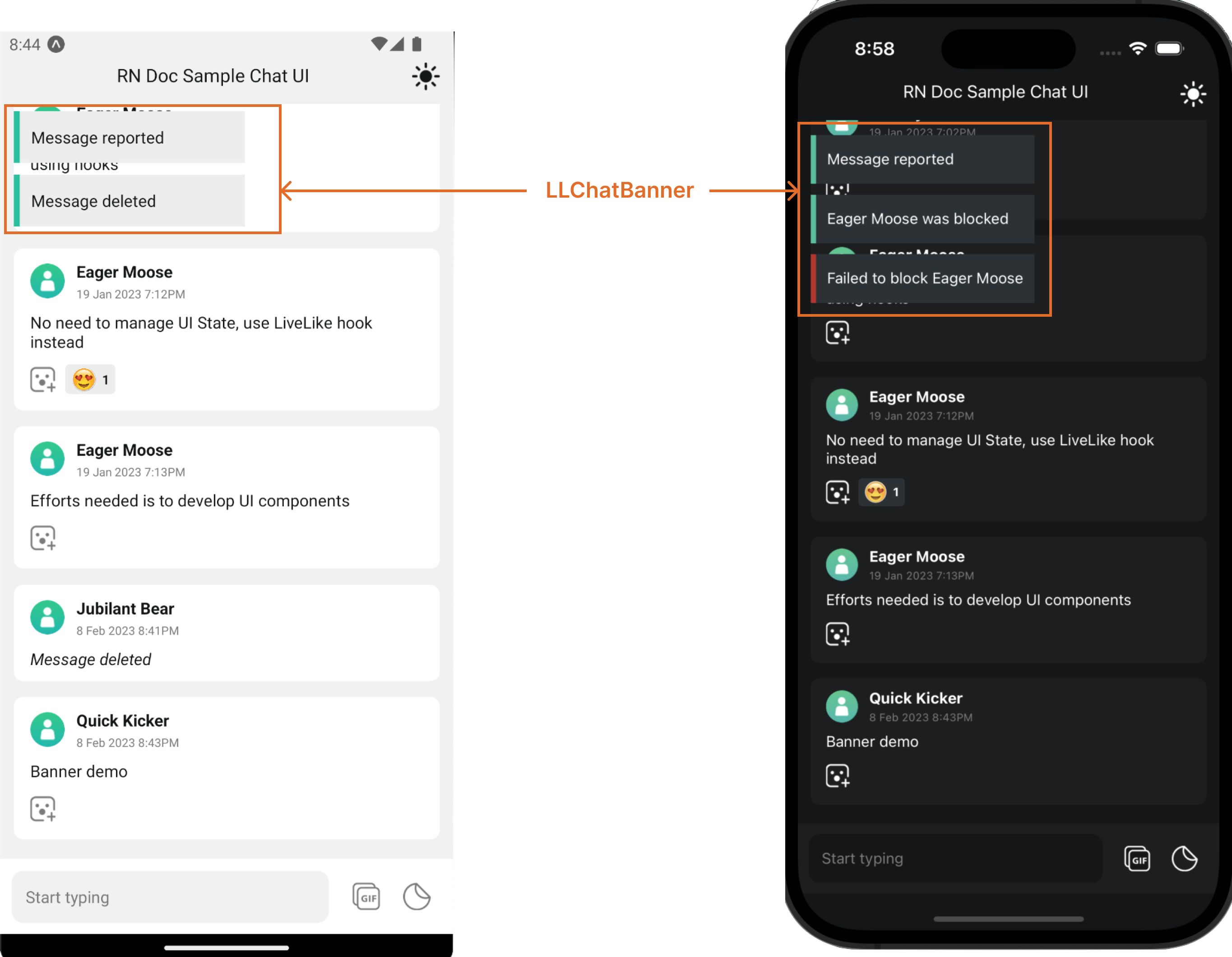
LLChatBanner is rendered in response to any moderation based action for eg Reporting a message, deleting a message or blocking a profile. The banner items are stacked on bottom of each other where each top most item auto hide after a configurable timeout.
TypeScript
import React from 'react';
import {
  LLChat,
  LLChatBanner,
  LLChatBannerStyles,
} from '@livelike/react-native';
import { StyleSheet } from 'react-native';

export function MyApp() {
  return (
    <LLChat
      roomId="<Your chat room id>"
      BannerComponent={() => (
        <LLChatBanner bannerTimeout={2000} styles={bannerStyle} />
      )}
    />
  );
}

const bannerStyle: Partial<LLChatBannerStyles> = StyleSheet.create({
  bannerContainer: { top: 10, left: 10 },
});Auto hides top most banner item based on given timeout (in ms).
TypeScript
import React from 'react';
import {
  LLChat,
  LLChatBanner,
  LLChatBannerItemProps,
} from '@livelike/react-native';

function MyBannerItem(props: LLChatBannerItemProps) {
  // render your custom chat header
}

export function MyApp() {
  return (
    <LLChat
      roomId="<Your chat room id>"
      BannerComponent={() => (
        <LLChatBanner BannerItemComponent={MyBannerItem} />
      )}
    />
  );
}Type Default LLChatBannerItemStyles No Default, if present styles props would be applied on top of internal LLChatBannerItem styles.
TypeScript
import React from 'react';
import {
  LLChat,
  LLChatBanner,
  LLChatBannerItemStyles,
} from '@livelike/react-native';
import { StyleSheet } from 'react-native';

export function MyApp() {
  return (
    <LLChat
      roomId="<Your chat room id>"
      BannerComponent={() => (
        <LLChatBanner BannerItemComponentStyles={bannerItemStyle} />
      )}
    />
  );
}

const bannerItemStyle: Partial<LLChatBannerItemStyles> = StyleSheet.create({
  bannerText: { fontSize: 15 },
  itemContainer: { height: 20 },
});Type Default StyleSheet of type LLChatBannerStyles No Default, if present styles props would be applied on top of internal LLChatBanner styles.
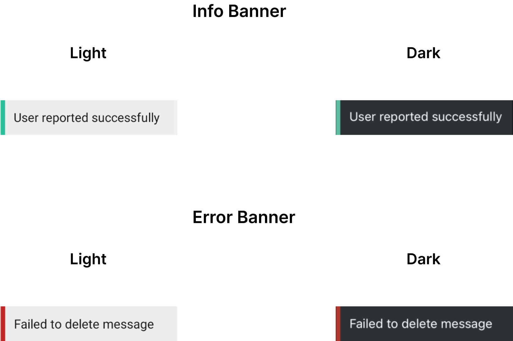
CSS Class Type Description bannerContainer ViewStyle Banner container
LLChatBannerItem component is rendered by the LLChatBanner component and represents a single chat banner item
Type Default String (Required ) No Default
Type Default StyleSheet of type LLChatBannerItemStyles No Default, if present styles props would be applied on top of internal LLChatBannerItem styles.
CSS Class Type Description itemContainer ViewStyle Banner item container bannerIndicator ViewStyle Left indicator in the banner item bannerText TextStyle Text in the banner item