Custom Theming
Customize Your Theme
The Engagement SDK allows you to customize fonts, colors, corner radii, padding, margins and spacing to conform to your style guide. The snippets below show chat corner radii and chat background colors, as well as widget corner radii and widget background colors as sample customizations.
Currently there are two different approaches in creating themes. To use the theme web tool approach please see the Custom Themes page. To use the Theme() object approach, continue reading.
To get started, create a theme object, adjust the relevant properties, and apply that object to your WidgetPopupViewController and ChatViewController. For the full list of customizable properties see the API Reference.
The same widget with different themes:


We recommend applying your theme before addingWidgetPopupViewControllerandChatViewControllerinto your layout.
Overriding Widget Lottie AnimationsYou can also override the default Lottie animations for some widgets. To do this you need to provide the full filepath that points to your custom animation (Lottie compatible json file). You can provide 1 or more custom animations. If more than 1 animation is provided we will cycle through those in random order. Instructions for creating the Lottie animation can be found here.

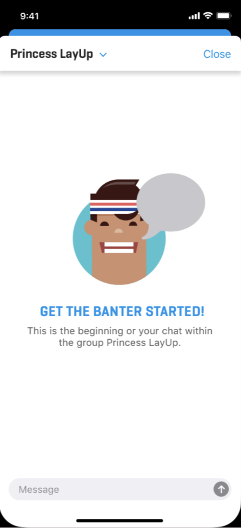
Customize Empty Chat ViewYou can provide the EngagementSDK with a UIView to display within the ChatViewController's message container when there are 0 messages in a chat room.
The custom view will fill the message container's height and width.
The custom view will disappear after the first message has been sent to the chat room.
let customTheme = Theme()
customTheme.chatCornerRadius = 16
customTheme.chatBodyBackgroundColor = .red
customTheme.widgetCornerRadius = 8
customTheme.widgetBodyColor = .blue
if let font = UIFont(name: "<font-name>", size: 16) {
    customTheme.fontPrimary = font
}

//Overriding win lottie animations
let filePathOfWinAnimation1 = Bundle.main.path(forResource: "custom_win1", ofType: "json")!
let filePathOfWinAnimation2 = Bundle.main.path(forResource: "custom_win2", ofType: "json")!
customTheme.filepathsForLottieWinningAnimations = [
  filePathOfCustomAnimation1,
  filePathOfCustomAnimation2,
]

//Overriding lose lottie animations
let filePathOfLoseAnimation1 = Bundle.main.path(forResource: "custom_lose1", ofType: "json")!
customTheme.filepathsForLottieWinningAnimations = [
  filePathOfLoseAnimation1
]

//Customize empty chat view (with subviews and contraints)
customTheme.emptyChatCustomView = {
    // The root view
    let container: UIView()

    // Additional ui elements
    let image: UIImageView()
    let title: UILabel()
    let body: UIlabel()

    /// add additional ui as subviews to root view
    container.addSubview(image)
    container.addSubview(title)
    container.addSubview(body)

    NSLayoutConstraints.activate([
        // Apply layout constraints
    ])

    // return the root view
    return container
}()

widgetViewController.setTheme(customTheme)
chatViewController.setTheme(customTheme)
Customize Chat Avatar Image
Chat avatar image is an image that appears next to a chat message. This functionality is disabled by default. To enable chat avatar image you need to pass an image URL to the ContentSession.updateUserChatRoomImage function and
set the chat avatar image width and height on your theme object.
// Setting Image
let session: ContentSession
override func viewDidAppear(_ animated: Bool) {
  super.viewDidAppear(animated)
	session.updateUserChatRoomImage(url:<image url> ,
  	                              completion: {},
    	                            failure: { error in })
}

// Modifying the Theme
let sampleTheme = Theme()
sampleTheme.chatImageWidth = 20.0
sampleTheme.chatImageHeight = 20.0
Updated 6 months ago
