

LLChat
LLChat is the main Chat UI component that renders the chat room UI with a chat header, message list, message composer and chat banner.
Pre-requisiteMake sure you initialise the SDK.
import { LLChat } from '@livelike/react-native'

export function MyChat(){
	return <LLChat roomId="xxx-yyy-zzz-www-vvv"/>
}
Snack Expo playgroundRefer LLChat snack expo playground
Hooks used by LLChat
LLChat- useChatRoom
- [useLoadStickerPacksEffect] (react-native-useloadstickerpackseffect)
- useStyles
LLChat component hierarchy:
LLChat component hierarchy: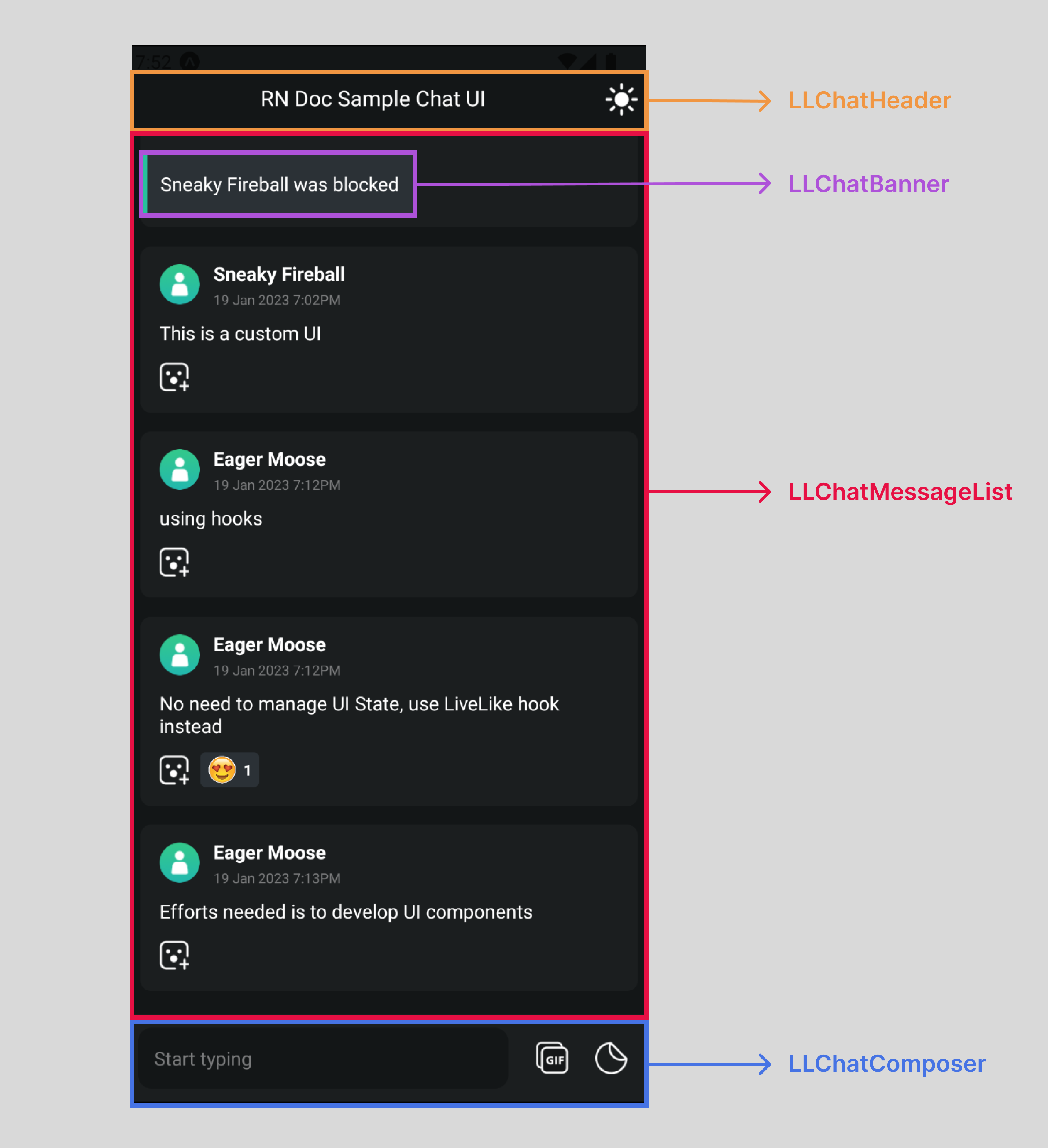
LLChat Props
Customisation Core conceptRefer customisation core concepts to understand different level of component customisation that could be achieved through below mentioned props.
roomId
roomId| Type | Default |
|---|---|
| String (Required) | No Default |
This is the room Id of the chat (that you can get from the producer suite). In case of dynamic chat room, you can use getChatRooms JS API to fetch all chat rooms in an application.
userAvatarUrl
userAvatarUrl| Type | Default |
|---|---|
| String | No Default |
This property allows integrators to set avatars for the LLChat component by providing an avatar image URL. To set a custom avatar for an LLChat instance, use the userAvatarUrl property and provide the URL of the desired avatar image. Here's an example of how to use it:
<LLChat
  roomId="xxx-yyy-zzz-www-vvv"
  userAvatarUrl='https://example.com/avatar.png'
/>
styles
styles| Type | Default |
|---|---|
| LLChatStyles | No Default, if present styles props would be applied on top of internal styles of type LLChatStyles |
LLChatStyles stylesheet
LLChatStyles stylesheet| Stylesheet prop name | Description |
|---|---|
chatContainer | Chat view container styles. This container wraps all the chat components. |
HeaderComponent
HeaderComponent| Type | Default |
|---|---|
| React Component of type LLChatHeader | LLChatHeader |
Rendered at the top of the Chat UI. This prop could be used to pass your custom HeaderComponent
Example usage:
import { LLChat, LLChatHeaderProps } from '@livelike/react-native';

function MyChatHeader(props: LLChatHeaderProps) {
  // render your custom chat header
}

export function MyApp() {
  return <LLChat roomId="<Your chat room id>" HeaderComponent={MyChatHeader} />;
}
HeaderComponentStyles
HeaderComponentStyles| Type | Default |
|---|---|
| LLChatHeaderStyles | No Default, if present styles props would be applied on top of internal LLChatHeader styles |
HeaderComponent styles prop which could be used to modify styles of default rendered LLChatHeader component.
BannerComponent
BannerComponent| Type | Default |
|---|---|
| React component of type LLChatBanner | LLChatBanner |
BannerComponent is rendered in response to any moderation based action for eg Reporting a message, deleting a message or blocking a profile.
This prop could be used to pass your custom Banner Component.
Example usage:
import { LLChat, LLChatBannerProps } from '@livelike/react-native';

function MyChatBanner(props: LLChatBannerProps) {
  // render your custom chat banner
}

export function MyApp() {
  return <LLChat roomId="<Your chat room id>" BannerComponent={MyChatBanner} />;
}
BannerComponentStyles
BannerComponentStyles| Type | Default |
|---|---|
| LLChatBannerStyles | No Default, if present styles props would be applied on top of internal LLChatBanner styles |
BannerComponent styles prop which could be used to modify styles of default rendered LLChatBanner component.
MessageListComponent
MessageListComponent| Type | Default |
|---|---|
| React Component of type LLChatMessageList | LLChatMessageList |
Rendered as the chat message list. This prop could be used to pass your custom message list component. Internally we render FlatList component from react-native. In case there's need of customising default rendered message item, use this prop to pass your custom message item component
Example usage:
import {
  LLChat,
  LLChatMessageList,
  LLChatMessageListProps,
  LLChatMessageItemProps,
} from '@livelike/react-native';

function MyListItem(props: LLChatMessageItemProps) {
  // render your custom message item prop
}
function MyList(props: LLChatMessageListProps) {
  return <LLChatMessageList {...props} />;
}

export function MyApp() {
  return <LLChat roomId="<Your chat room id>" MessageListComponent={MyList} />;
}
MessageListComponentStyles
MessageListComponentStyles| Type | Default |
|---|---|
| LLChatMessageListStyles | No Default, if present styles props would be applied on top of internal LLChatMessageList styles |
MessageListComponent styles prop which could be used to modify styles of default rendered LLChatMessageList component.
MessageComposerComponent
MessageComposerComponent| Type | Default |
|---|---|
| React Component of type LLChatMessageComposer | LLChatMessageComposer |
Rendered at the bottom of the Chat UI. This prop could be used to pass your custom composer component. This component renders:
TextInput- To send a text message.Sticker Picker- To pick and send sticker image messageGif Picker- To pick and send gif message.
Example usage:
import { LLChat, LLChatMessageComposerProps } from '@livelike/react-native';

function MyComposer(props: LLChatMessageComposerProps) {
  // render your custom composer component
}

export function MyApp() {
  return (
    <LLChat
      roomId="<Your chat room id>"
      MessageComposerComponent={MyComposer}
    />
  );
}
MessageComposerComponentStyles
MessageComposerComponentStyles| Type | Default |
|---|---|
| LLChatMessageComposerStyles | No Default, if present styles props would be applied on top of internal LLChatMessageComposer styles |
Message composer component styles prop which could be used to modify styles of default rendered LLChatMessageComposer component.
Updated 10 months ago